



In the world of solo creators and small teams, the promise of a personal dashboard is alluring: a single pane of glass to view your tasks, notes, metrics, calendars, and essential links. It’s meant to be your command center, a productivity hub that streamlines your day. Yet, for many, these ambitious projects quickly devolve into another ‘app graveyard’ – a digital space where once-promising tools and meticulously crafted layouts go to die, abandoned after the initial burst of enthusiasm.
You’ve probably been there. You spend hours setting up a beautiful Notion page, linking countless databases, or customizing a browser start page with every widget imaginable. For a week, it’s glorious. Then, slowly, the updates stop. The links break. The data becomes stale. And before you know it, you’re back to scattered tabs and forgotten notes, wondering why your grand vision for organization never stuck.
This guide isn’t about finding the ‘perfect’ dashboard tool. It’s about building a personal dashboard that actually stays useful, week after week, month after month. We’ll focus on principles of simplicity, purpose, and sustainable maintenance, ensuring your dashboard becomes a living, breathing part of your workflow, not just another digital relic.
The Core Problem: Over-Engineering and Under-Maintenance
Why do so many personal dashboards fail? The root cause often lies in two interconnected issues: over-engineering and under-maintenance. We tend to approach dashboard creation with the mindset of building a complex software application, rather than a personal utility.
The temptation is strong to integrate every possible data source, automate every minor update, and design a visually stunning interface from day one. This leads to a system that is brittle, complex, and demanding of constant attention. When the initial novelty wears off, the sheer effort required to keep it updated outweighs its perceived value, leading to abandonment.
Furthermore, many dashboards are built without a clear, defined purpose beyond a vague notion of ‘being organized.’ Without understanding the specific problems you’re trying to solve or the decisions you need to make, your dashboard becomes a collection of information rather than a tool for action. It’s like building a car without knowing if you need it for racing, commuting, or off-roading – it might look impressive, but it won’t serve a specific need effectively.
Principle 1: Start with “Why” – Your Dashboard’s Purpose
Before you even think about tools or layouts, ask yourself: Why do I need a dashboard? What specific problems is it going to solve for me or my small team? A dashboard isn’t just a display; it’s a decision-making and action-triggering tool. Without a clear purpose, it’s just noise.
Consider these questions to define your ‘why’:
- What information do I absolutely need to see every day to stay on track?
- What decisions do I make regularly that could be informed by a quick glance at key data?
- What are the most common points of friction or inefficiency in my current workflow?
- What metrics, if any, are critical for me to monitor for my business or projects?
- What links or resources do I frequently search for?
For a solo creator, your ‘why’ might be to quickly see your content calendar, current project tasks, and social media growth. For a small team, it might be to track shared project progress, team availability, and key client communications. Be specific. This clarity will be your compass.
Principle 2: Embrace Simplicity – The “Minimum Viable Dashboard”
The concept of a ‘Minimum Viable Product’ (MVP) applies perfectly to personal dashboards. Instead of trying to build the ultimate, all-encompassing system from day one, aim for a ‘Minimum Viable Dashboard’ (MVD). This is the simplest possible version that still delivers core value.
An MVD focuses on just 2-3 essential data points or functions that directly address your ‘why.’ It’s intentionally lean, designed to be easy to set up, quick to use, and simple to maintain. The goal is to get something useful working quickly, then iterate and expand only when a clear need arises.
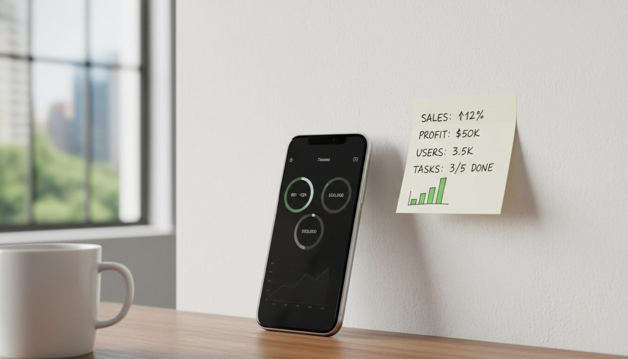
Think of it as a single, well-organized sticky note rather than a sprawling whiteboard. What are the absolute non-negotiables? What information, if missing, would genuinely hinder your day? Start there, and resist the urge to add anything else until the core is stable and consistently used.
What to Include: Essential Modules for Solo Creators
While your specific needs will dictate the exact modules, here are common, high-impact categories that solo creators and small teams often find invaluable:
Tasks & Projects
This is often the cornerstone. Your dashboard should provide an immediate overview of your most critical tasks and current project statuses. This isn’t a full project management tool, but rather a filtered view of what needs your attention now. Think ‘today’s priorities,’ ‘next actions,’ or ‘upcoming deadlines.’
Notes & Ideas
A quick capture area for fleeting thoughts, meeting notes, or content ideas is crucial. This could be a simple text field, a link to your preferred note-taking app, or a dedicated section for ‘inbox’ notes that you process later. The key is low friction for capture.
Calendar & Schedule
Knowing what’s coming up is vital. Integrate a simple view of your calendar – upcoming meetings, deadlines, or content publication dates. Again, this isn’t your full calendar app, but a glanceable summary of the next few hours or days.
Key Metrics
For creators, this might include social media follower counts, website traffic, email list growth, or even basic revenue figures. Choose only 1-3 metrics that genuinely inform your strategy or motivate you. Avoid vanity metrics that don’t drive action.
Quick Links
A curated list of your most frequently used tools, documents, or resources. This saves countless clicks and searches throughout the day. Think ‘daily drivers’ – your CRM, content editor, analytics dashboard, or a shared team document.
Choosing Your Foundation: Tools That Stick
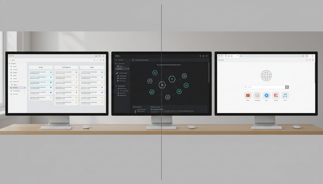
The ‘best’ tool is the one you’ll actually use. Focus on flexibility, ease of integration (or lack thereof), and a low barrier to maintenance. Here are a few common approaches:
No-Code/Low-Code Platforms (e.g., Notion, Coda, Airtable)
These are popular for a reason: immense flexibility. You can build highly customized pages with databases, linked views, and embedded content. They excel at bringing disparate information together. The downside? The very flexibility can lead to over-engineering. Start simple, use templates, and resist the urge to build a ‘perfect’ system from scratch.
Personal Knowledge Management (PKM) Tools (e.g., Obsidian, Roam Research)
If your primary need is to connect ideas, notes, and tasks in a highly interlinked way, a PKM tool might be your foundation. Obsidian, for example, allows you to create a ‘daily note’ that can serve as a dashboard, pulling in tasks, linking to relevant projects, and offering a space for reflection. These are powerful for deep thinkers but might be overkill if your needs are purely operational.
Simple Web Page / Browser Start Page (e.g., Raindrop.io, Momentum, custom HTML)
Sometimes, the simplest solution is the most robust. A custom HTML page or a browser extension that acts as your start page can be incredibly effective. You can hardcode links, embed simple widgets (like a weather forecast or a clock), and keep it incredibly lightweight. Tools like Raindrop.io can serve as a powerful link manager that doubles as a quick-access dashboard for resources.
Hybrid Approaches
Don’t feel limited to one tool. You might use Notion as your central hub, but embed a Google Calendar view and link out to your Obsidian vault for deep notes. The key is to make the connections seamless and the information accessible without requiring constant context switching.
Building It Out: A Step-by-Step Checklist
Ready to build your dashboard without creating another app graveyard? Follow this checklist:
- Define Your Core Purpose: Clearly articulate 1-3 specific problems your dashboard will solve.
- List Essential Data Points: Identify the 3-5 pieces of information you absolutely need at a glance.
- Choose Your Primary Tool: Select one foundation (Notion, Obsidian, simple HTML, etc.) that best fits your comfort level and core needs.
- Sketch Your Layout: On paper or digitally, block out where your essential modules will live. Prioritize glanceability.
- Implement Core Modules: Set up only the 2-3 most critical sections. For example, ‘Today’s Tasks’ and ‘Quick Links.’
- Integrate (Lightly): If necessary, connect to external tools, but prioritize direct links over complex APIs or embeds initially.
- Design for Glanceability: Use clear headings, bullet points, and minimal visual clutter. The goal is information at a glance, not deep reading.
- Test and Use Daily: Actively use your MVD for at least a week. Pay attention to what’s useful and what’s ignored.
- Set a Review Schedule: Block out 15-30 minutes weekly or bi-weekly to review, prune, and iterate on your dashboard.
Maintenance and Evolution: Keeping Your Dashboard Alive
The biggest differentiator between a successful dashboard and an app graveyard is consistent, low-effort maintenance. Your dashboard isn’t a static artifact; it’s a living tool that needs occasional care.
- Regular Review: Schedule a recurring 15-minute slot (e.g., every Friday afternoon) to check your dashboard. Are all links working? Is the data current? Is anything redundant?
- Prune Ruthlessly: If a section or link hasn’t been used in a month, delete it. Every element on your dashboard should earn its place by providing clear value.
- Adapt to Changing Needs: Your workflow and priorities will evolve. Your dashboard should too. Don’t be afraid to add or remove modules as your focus shifts.
- The “One-Click Rule” for Updates: If updating a piece of information on your dashboard takes more than one click or a few seconds, it’s too cumbersome. Find a simpler way or remove it. This applies to manual updates especially.
Think of your dashboard as a garden. You plant the essentials, water them regularly, and occasionally weed out what’s no longer serving its purpose. It’s an ongoing process, not a one-time build.

Common Pitfalls to Avoid
Even with the best intentions, it’s easy to fall into traps. Be mindful of these common pitfalls:
- Over-Automation: While automation can be great, too much too soon can create brittle systems that break easily and are hard to troubleshoot. Start manual, automate only when a clear, repetitive need arises.
- Information Overload: A dashboard filled with too much data is just as useless as no dashboard at all. Prioritize clarity and conciseness. Less is often more.
- Trying to Make It “Perfect” from Day One: Perfection is the enemy of good enough. Get your MVD working, then iterate. Your dashboard will evolve over time, and that’s okay.
- Ignoring the “Human Element”: Your dashboard should fit your natural workflow, not force you into an unnatural one. If you find yourself fighting against it, something needs to change.
Building a personal dashboard that truly sticks isn’t about finding the latest, most powerful tool. It’s about intentional design, starting small, focusing on purpose, and committing to light, consistent maintenance. By embracing simplicity and understanding your ‘why,’ you can create a digital command center that genuinely supports your creative endeavors and helps you avoid the dreaded app graveyard.
Your dashboard should be a launchpad for action, not just a pretty display. Keep it lean, keep it purposeful, and watch it become an indispensable part of your daily success.